Always start with research. And if the research shows that a "better", more articulated, "designed", easier to use website is what's called for - this set of articles will give you a high-level UX approach on how you could build it.
Also, these articles only cover:
- research
- usability studies
- information architecture
- content strategy
They do not cover:
- visual design
- interaction design
If you have follow-up questions please let me know at MyFirstName [at] MyFirstNameMyLastName.com.
#1 - More research
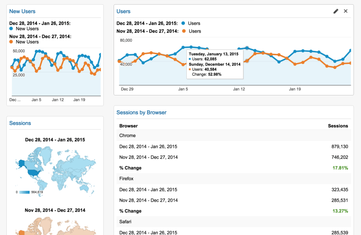
If you don't have analytics up and tracking on your website. Get it setup. Now. Already have it tracking useful data? Great - you're going to need this later.
I use Google Analytics. It's free and comes packed with features.
#2 - Talk with people who use the system

- Building a customer facing website? Talk with real customers.
- Building an intranet for employees? Talk with employees.
Ask these folks how they use the system. Ask them what they would expect to be able to do and accomplish or what information would be available from the website.
#3 - Do a competitor analysis
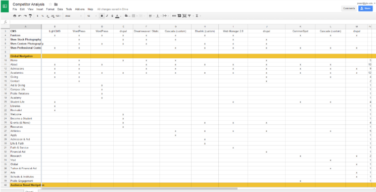
Ask the people who hired you who their competitors are - both real and perceived. You can also break this down by "closeness" - from direct competitors to less direct competitors.
- Find out what they use for their website software, commonly known as a CMS or Content Management System.
- Do their competitors use stock or custom photography?
- What are your competitor's colors?
- How do they organize their website?
- Do they have subsites?
- What terminology or language do they use for navigation headings?
- Do they make use of video on their website?
- Do they use social media? Which channels?
I have a list of competitors in a bookmarked folder. Every few months I open the list and see what (if anything) has changed on those sites.
#4 - Create personas
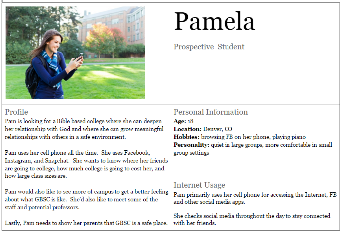
Use personas to bring attention to your specific types of customers. I'm in higher education so this primarily revolves around prospective students, current students, parents, alumni, donors, etc.
#5 - Build red routes
Red routes show the absolute top priority items on your website and even prioritizes them in a way which shows which pages will need more attention.
#6 - Homepage usability guidelines
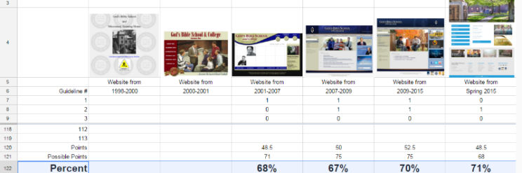
Jakob Nielsen and Marie Tahir wrote a fantastic book back in the day called "Homepage Usability - 50 Websites Deconstructed." You can now find all the guidelines online at the Nielsen Norman Group's website.
Judge your current website against this. Follow the guidelines and help users.
You can even use the Wayback Machine to do this exercise on all your homepages over time to see how the design and organization have been executed.
Conclusion
The first step in any project should be to make sure you're building the right thing and you can't find that out unless you do your research.
For more tips on how to build a better UX be sure to check out the other articles in this series:
- Part 1 - Research
- Part 2 - Usability Testing
- Part 3 - Information Architecture
- Part 4 -Content Strategy
- Part 5 - BONUS - WordPress